ShopDreamUp AI ArtDreamUp
Deviation Actions


Suggested Deviants


Suggested Collections


You Might Like…


Featured in Groups


Description
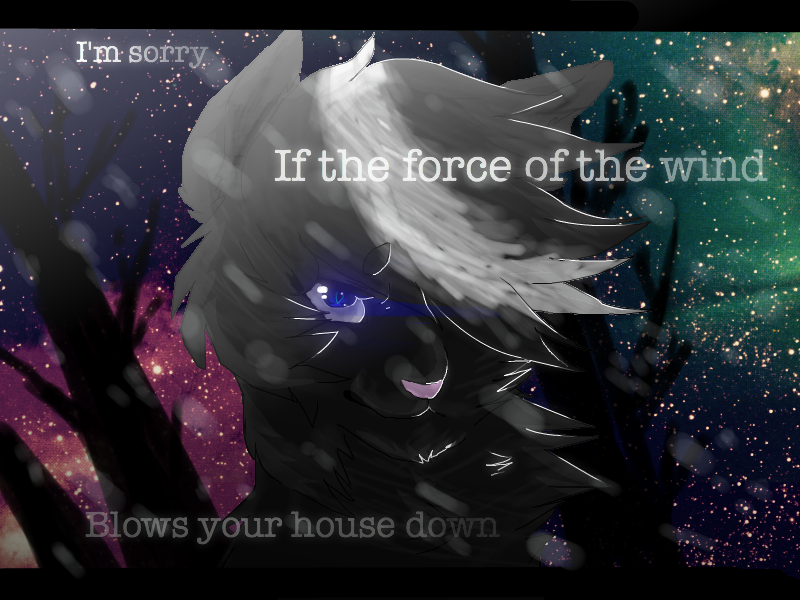
30  point head-shot commission for *leafystarthegreat
--
Thanks livestreamers for watching.
She wanted that quote on it, so there ya go.
You look dramatic in this leafyyy
Hope you like it
--
arts:Me
Char:Hers
--
Thanks livestreamers for watching.
She wanted that quote on it, so there ya go.
You look dramatic in this leafyyy
Hope you like it
--
arts:Me
Char:Hers
Image size
800x600px 686 KB
© 2013 - 2024 SimplyMisty
Comments81
Join the community to add your comment. Already a deviant? Log In
A black animal with a white forelock is nothing interesting, and the pose isn't very unique - it has some originality in that the eye-glow moves with the wind, and the choice of background is unusual, however; those things offer an otherwise very un-unique piece some form of uniqueness - and really do help it pull ahead. The concept and vision behind the piece are interesting, but feel like they're being played more for dramatic effect than for a character reason; the concept behind this piece is easily its strongest point.
What holds it back? Poor technique. Structurally, the character is somewhat sound; the grain of the fur is extremely inconsistent, however, and the "locks" blow awkwardly and in a way inconsistent with actual fur. The large streaks of white that run across the image are ambiguous; are they meant to be the wind? I thought they might be ash, but the description doesn't support that; they don't really look that much like anything. They could use more refinement; right now, they only obfuscate the image. The lineart is awkwardly colored (the swaps between black and white feel out-of-place) and looks strange in some areas (particularly along the left of the head; there are also spots on the right side with stuff coming outside the lines) and though the trees are just fine, they don't fit the style of the character (anime-realism) or the background (stock image).
Specifically, the worst is at the top of the head. The locks imply the fur should be moving in more of an arc than it is - you can get an approximation of direction by drawing lines from the origin of the fur to the end of the locks. Fur direction is this piece's greatest weakness.
Presuming the background is a stock image, its source should probably be mentioned, even if it's non-mandatory! It makes you look unscrupulous otherwise.
I started with the good, and put bad in the middle; I'm going to end with more good. As mentioned before, the trees are very well-done. The eye is beautiful, and though the direction on it is poor the fur texture itself is pretty passable. The image's strongest point is the text; the font is gorgeous, the color (and its slight variations) a wonderful choice, and the glow quite pretty. In spite of its other flaws, I can honestly say I like this picture - and the text is really the reason why.